


02/01/2016
Our Logo: the concept
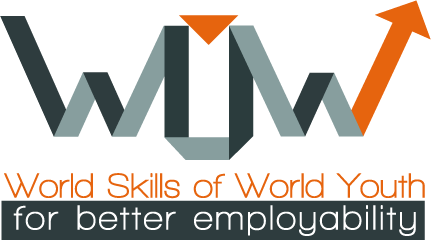
Our Web Designer Monica Zanatta presents the logo of the WOW Project.
Concept
The Logo root is created by a line, to inspire the possibility to achieve a task. The Up Arrow at the end of the line represent the occupational growth and the personal success (toward the world), the inside arrow means the person and the individual mindfullnes, after that the growth became truth.
Font
The font is Wlakway, a compromise between energy and creativity. This font is free.
Colors
The cromatic proposal link a "color-no-color" like metal, inspired by technology to a fluorescent color, young and dynamic. The approah of the color is gender-neutral.
Versions
The logo is also in black and white to be use in documents.